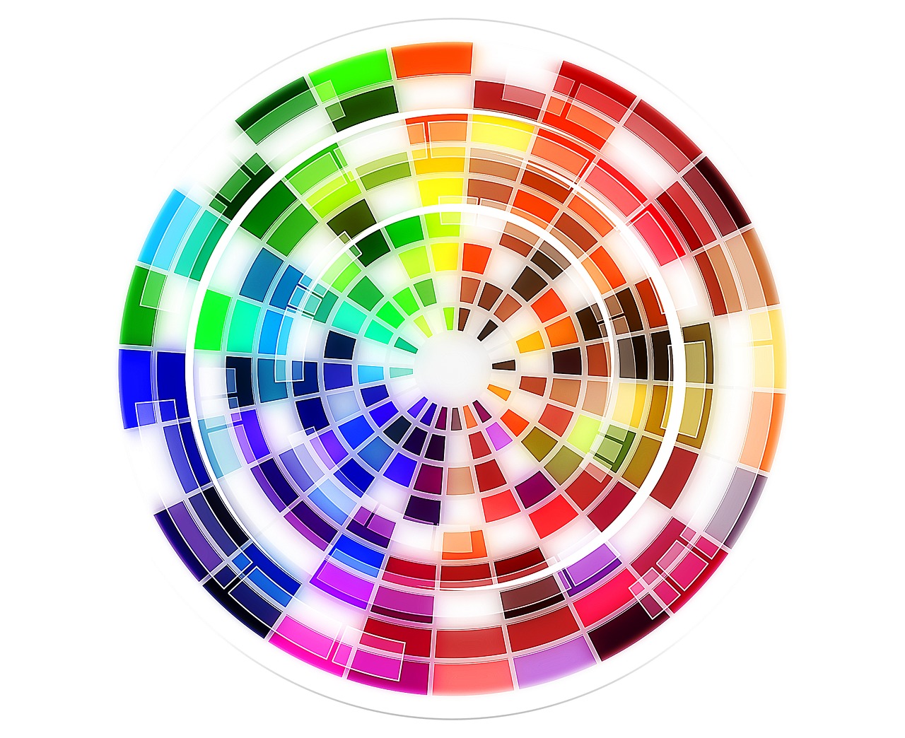
The main purpose of a color wheel is to show the relationship between colors and choose and create a design that looks beautiful.
Studying the color wheel will help you in art class the basics "do"s and "don't"s of color. People in many types of jobs rely
on the color wheel. From illustrators, to interior designers, to people who paint cars, they use color theory learned on
the color wheel.
What Is a Color Wheel?
A color wheel is a circle-shaped diagram that organizes colors by type and hue. This way of presenting colors was developed
by Sir Isaac Newton back in 1704. The color wheel defines specific types of colors, like primary and complementary colors.
The asymmetrical color wheel features just six colors: orange, yellow, red, blue, green, violet, and indigo.
What Are Primary Colors?
These are colors that are combined with other colors in order to create new ones. The primary colors are yellow, blue, and
red. Many of the colors presented on a color wheel stem from one primary color being mixed with another one. Some color
experts suggest that alternative colors used in the wheel are more accurate. An example is the color wheel used in printer
cartridges. In those, the primary colors are cyan, magenta, yellow, and black. When a person prints a document, this assortment
of colors forms a wider array of tones.
What Are Secondary Colors?
These are the end results of what happens when two primary colors are mixed together. There are three of these in a traditional
model. They are orange (a mixture of red plus yellow), green (blue mixed with yellow), and purple (red and blue.)
What Are Tertiary Colors?
These colors are the result of a primary color combined with a secondary color. The six resulting hues are amber, magenta,
teal, vermillion, violet, and chartreuse.
What Are Complementary Colors?
On a color wheel, complementary shades are opposite to each other. These colors look great when placed next to each other.
For example, green can be used with red, orange with blue, and purple with yellow. Take a look around, and you'll see this
in artwork, fashion, photography, and even car and truck paint jobs.
What Are Analogous Colors?
Analogous colors sit next to each on the wheel. Some ideas on how to utilize them include red alongside vermillion or orange,
yellow with green, and blue along with violet and teal. The trio of colors in each pairing has a common hue that gives them
a matching appearance.
What Is Color Theory?
This phrase describes a set of guidelines about how color works.
1. Color Harmony: This describes a set of colors that are pleasing to look at. Color has a big effect on mood and
harmonious colors make us feel happy. A harmonious color scheme has something called visual order.
2. Color Temperature: This is the systematic break down of colors into warmer colors (typically identified
with daylight and sunset) and cooler colors (connected to low light situations.) This philosophy turns up a lot in fashion.
Clothes are worn and designed to match different seasons and skin tones.
3. Color Context: Sometimes colors look different when used in specific ways. This phenomenon is color
context. When a person pairs an orange top with a strong yellow pair of slacks, the orange top will appear duller. On the
other hand, when that same orange top is worn with dark purple pants, the orange color pops.
Additional Resources